While working for the Neopets team I had the pleasure of working with them to revamp one of the biggest and most popular yearly events on Neopets: The Altador Cup!

If you're not familiar with Neopets, the Altador Cup is a month-long tournament where players can join a team based on a Land in Neopia and compete against each other in various games. Competing in the games gives players points they can use at the prize shop to get items at the end of the event. These items can be cosmetics, food, collectable objects and more.
The event is separated into 3 different stages:
Pre-Event: Press Tour
Main event: Main Tournament, Staff Tournament, NeoCash ("NC") Tie-In Event
Post Event: Prize shop
Design Goals
Taking the event from Classic to HTML5 and making it mobile friendly
Modernizing the pages and visuals while still keeping the charm of Neopets
QOL and UX improvements to improve the overall Altador Cup experience
Research and Pain Points
One of the first steps I did was to research past events and gather past event feedback. I took a look at each page and wrote down what could be improved upon. Unfortunately due to the scope and timing of the event, we weren't able to update the games themselves and focused more on the hub pages. Once I got a general idea of the user paint points and areas that could be improved I started wireframing utilizing some past assets we've created putting everything in Adobe XD. Below I share a few of the designs and what changed.
Wireframes
Overall I noticed that some of the classic pages varied drastically in layout which made the scope high for the art team. They would have to make assets specifically for each page. I aimed to have all the designs as part of a hub page, with a navigation bar, using the same layout to minimize the scope for art and development time. This also helped with making navigation easier and keeping all the pages within the different stages of the event consistent and cohesive.
Press Tour

Leading up to the Altador Cup we spend a week doing a "Press Tour" where we introduce a few teams a day with their rosters, team bios, and yearly team support NC items. The layout was updated to showcase the information and content in a clearer way. Some ways I did this:
Displayed sign-up starting timer in a dedicated panel
Removed see-through background art on panels which caused visual clutter
Moved Team/Land icons below the press tour feature in a dedicated panel to make them stand out
Final Implementation

Above is a screenshot of the implementation, we ended up keeping all the team icons in one row instead of two to save on space! We also removed the news and other article modules, having them displayed after the press tour.
The background also gave an immersive feel making players feel like they are on the field themselves!
Sign-Ups

On the Sign Ups page, players can browse the available teams and join them by tapping on a team icon below or on the map. After going through a variety of pop-ups they are added to the team and the page refreshes to display the main tournament page with a counter showing when the tournament will begin.
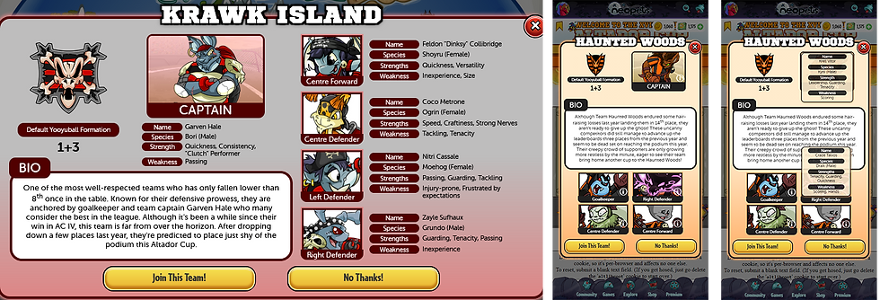
The design for the sign-ups didn't change too much, the goal here was to keep it consistent with the layouts of the other pages. The teams were kept similar to how it's displayed on the press tour page. I also worked on doing a visual update to all the pop-ups. An example of one of the pop-ups is shared below.

For the pop-ups, I aimed to create visual breaks to make the content easier to read and sift through. Separating the content into panels/sections and using headers helped with this. For mobile, in the initial wireframes, some information was omitted and content was moved around to account for the smaller screen size.
Final Implementation

For the main page, similar to the press tour page, we moved the icons from two rows to one to save space. For mobile, the team icons were placed in a carousel so players could easily navigate to the different teams.

Above is the implementation for the team pop-up. As a team, we discussed how we didn't want to omit information on mobile and looked into solutions to how we could bring it back. We were able to add the information back in by utilizing tooltips to display the team-specific information.
Main Tournament

And....now we have the main tournament! This is when players will play a set of games on the site and get points for participating that go towards their teams. The different teams are then ranked based on the points, this is periodically updated throughout the event.
What changed
Layout to be consistent with the new design
Visual enhancements such as containers, backgrounds, and headers to improve readability and make content easier to digest
Added plaque with player's team, their username, and rank so they can quickly see their progress while ranking up
On mobile, had content be minimizable or expanded
Final Implementation

We made a few updates while implementing the design, we removed the extra article module and kept the news one. We thought that should be sufficient to share anything about the event. We also ended up not adding the minimize options on mobile, we felt the content didn't feel too long to scroll through and didn't want players to miss any items or news.
I hope you enjoyed getting the behind-the-scenes on the revamp of the event, thanks for stopping by!
Comments